
Machine Learning Model Evaluation Metrics part 1: Classification
If you’re in the beginning of your machine learning journey, you may be taking online courses, reading books on the topic, dabbling with competitions and maybe even starting your own pet projects. If you do, you will inevitably start to notice that there’s more than one way to evaluate a trained model. This is especially apparent in competitions - some companies post a classification challenge where results are evaluated with ROC/AUC score, others with F1 score, log loss, or some other metric. Regression problems, of course, have their own zoo of evaluation metrics. At some point, you gotta ask yourself - why are there so many? What do they mean? How are they different? And, if I start my own project, how do I approach choosing a metric for it? I know I did ask myself those questions, and ended up spending a significant amount of time figuring these things out. So to save others the time and frustration I compiled what I now know about evaluation metrics into a talk called “Machine Learning Model Evaluation Metrics” which I have recently delivered at AnacondaCON in Austin, Texas. If you prefer reading blog posts over watching talks, I intend to publish a couple of blog posts on the topic, and this is the first one.
As a bonus, this format allows me to add more useful links :)
In this first post, I’ll focus on evaluation metrics for classification problems. And to make things a little simpler,
I’ll limit myself to binary classification problems. In the next post I’ll talk about how some of these metrics can be
extended to a multi-class problem.
Here’s what’s in this post:
- Classification accuracy
- Confusion matrix
- Precision, Recall, F1 Score
- Matthews Correlation Coefficient
- ROC Curve/AUC score
- Precision/Recall Curve
- Log Loss
Classification accuracy
Everybody who has ever build a classifier or read about building one has encountered classification accuracy. Classification accuracy (or simply, accuracy) is an evaluation metric that is a portion of correct predictions out of the total number of predictions produced by a ML model:
$$\text{Accuracy} = \frac{\text{Number of correct predictions}} {\text{Total number of predictions}}$$
Accuracy can range from 0 to 1 (or 0 to 100%), and it is easy to intuitively understand. In scikit-learn, all
estimators have a score method that gives you a default evaluation metric for your model, and for classifiers it is accuracy.
Here’s an example where I train a basic LogisticRegression on a dataset for a binary problem. Once I did that, I can call
the score method on my model, pass the test data and get the accuracy of my model on the test data.
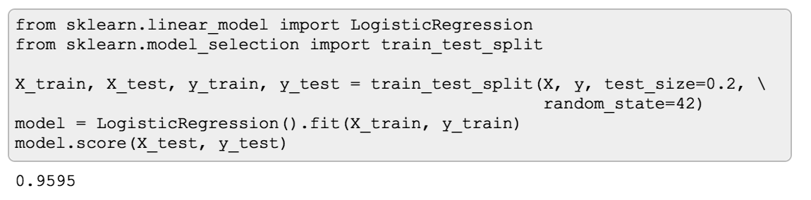
I got almost 96%! Woohoo! This is amazing! Or is it? That’s a trick question of course, because at this point we know too little and it’s impossible to say whether 96% accuracy is “good” or not. In this case, it turns out to be not that great.
To illustrate what I mean, I built a DummyClassifier
on the same data. A DummyClassifier in scikit-learn is a classifier that doesn’t learn anything from the data but simply
follows a given strategy. It can generate predictions by respecting the training set’s class distribution, or uniformly
at random, or, like in my case, it will always return the most frequent label in the training set.
You can use DummyClassifier in the same fashion as any other scikit-learn estimator, and like other classifiers it has
a score method that will return its accuracy. So, drumroll please…
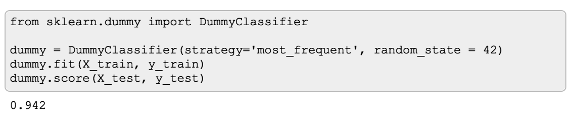
The DummyClassifier’s accuracy is 94%! This means my LogisticRegression model was only tiny bit better than
predicting the most frequent label in the training set which doesn’t seem so good anymore. Why is this happening?
The reason is in the data, and I haven’t shown you my data yet. For this example I used a synthetic dataset with 10 000 samples, where only 5% of them represent samples of the positive class, while 95% of samples are of negative class:
So even simply predicting negative class all the time we’ll get 95% accuracy. If you’re wondering why I got 94% and not 95% with the DummyClassifier, that would have to do with how the data got split into train and test sets.
This type of dataset is what’s called a class-imbalanced dataset, and unfortunately they are quite common. If you don’t know that you are working with a class-imbalanced data, classification accuracy can give you a false impression that your model is doing great when in reality it is not. So first things first - be sure to get to know your data!
Another thing to consider is that even if the data is balanced, if we’d like to improve the model, accuracy alone doesn’t give enough information to diagnose the errors the model is making. Luckily, there are other evaluation metrics and diagnostic tools available for classification models.
Confusion matrix
One of such tools is called Confusion Matrix. It is a table/matrix that shows how many samples a model classified correctly for what they are and how many were misclassified as something they are not.
Confusion matrix is more of a diagnostic tool rather than a metric - it can help you gain insight into the type of errors are model is making. Plus, there’s a number of evaluation metrics that can be derived from it.
To illustrate Confusion Matrix, I took Titanic dataset from kaggle where the goal is to predict survival of the passengers. Skipping all the data cleanup and feature engineering, here’s a basic RandomForestClassifier I built on the training data.
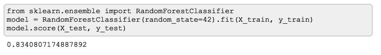
It has 83.4% accuracy on the test data, which is not too bad according to the Leaderboard :) But I still would like to learn what can be improved, and what the errors look like.
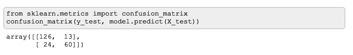
Let’s see what a confusion matrix would look like in this case. First, I need to import confusion_matrix from sklearn.metrics. Now, when calling confusion_matrix it’s important to remember that by convention, you need to provide the actual values first, then the predictions. The same convention is used for other metrics from sklearn.metrics.
Once I call confusion_matrix, I get this beautiful array where the numbers indicate what has been correctly classified and what wasn’t. If you haven’t seen a confusion matrix before, it may be unclear what’s what here.
To help understand it, confusion matrices are typically drawn as tables. I’ll do exactly the same:
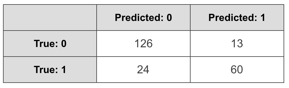
Here the rows represent actual values, and the columns stand for predicted. It’s important to note that this is a convention that is used in scikit-learn, and, for example, tensorflow, but there are tools that have it the other way around, so you may see tutorials and articles that have it the other way around (I’m looking at you, Wikipedia!). As if we needed to justify the word “confusion” in “confusion matrix” by constantly confusing what goes on what axis, sigh.
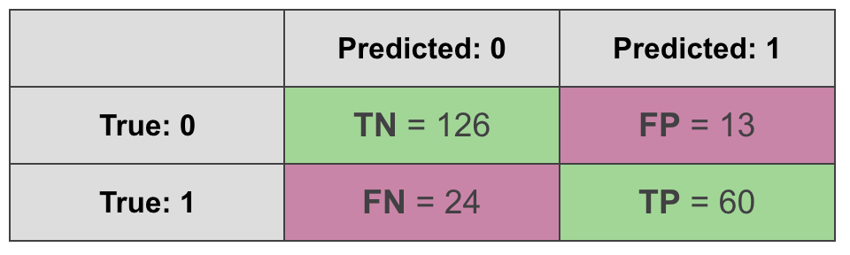
We can learn a lot from the confusion matrix. On the diagonal, you’ll find all the correct predictions:
- True Positives (TP): a sample was positive, and the model predicted a positive class for it.
- True Negatives (TN): a sample was negative, and the model predicted a negative class for it.
We also have two types of errors:
- False Positives (FP): a sample was negative, but the model predicted positive.
- False Negatives (FN): a sample was positive, but the model predicted negative.
If we sum up the correct predictions on the diagonal, and divide by the sum of all cells (all the predictions), we’ll get classification accuracy. But, of course, we can get some other interesting metrics from the confusion matrix.
Precision, Recall, F1 Score
Suppose we’re building a spam filter, where “spam” is a positive class, or a recommendation system where item being relevant is a positive class. In both cases, to make user experience better we really want to minimize False Positives. False Positive in a case of a spam filter would look like an important email classified as a spam, and that would make users annoyed. False Positive in a recommendation system would mean recommending something irrelevant, which again, can be annoying, and will contribute to negative user experience. How can we evaluate which model will be “better” in this case? One metric that can help is called Precision. Here’s the formula:
$$\text{Precision} = \frac {\text{TP}} {\text{TP} + \text{FP}}$$
We take the number of true positives, and divide it by the sum of true positives and false positives. If we happen to be so lucky that we don’t have any false positives, we’ll get a Precision of 1. And if we had some true positives and some false positives, and managed to reduce the number of false positives, this metric will get a little closer to 1 compared to what it was. If you care about minimizing the number of false positives, keep an eye on Precision.
Now let’s say we’re working on predicting cancer diagnosis. In this case the cost of False Negatives is high. If the model predicts a patient doesn’t have cancer (when in fact they do) and the patient is sent home, it can have much more serious implications compared to sending a healthy person for a few more tests. Or, if, say, we’re classifying fraudulent transactions, a false negative here can be quite costly. In cases like these, if you want to minimize the number of false negatives, the evaluation metric that can help is Recall. The formula is very similar to Precision, but now we take into account the number of false negatives instead of false positives:
$$\text{Recall} = \frac {\text{TP}} {\text{TP} + \text{FN}}$$
The choice of Precision or Recall as an evaluation metric depends largely on the business problem your model is intended to solve.
There’s also an evaluation metric that takes into account both Precision and Recall, and presents another way of summarising a confusion matrix in one number. It’s called F1 score, and it is the harmonic mean of Precision and Recall:
$$\text{F1 score} = \frac {2*\text{Precision}*\text{Recall}} {\text{Precision} + \text{Recall}} = \frac {2*\text{TP}} {2*\text{TP} + \text{FP} + \text{FN}}$$
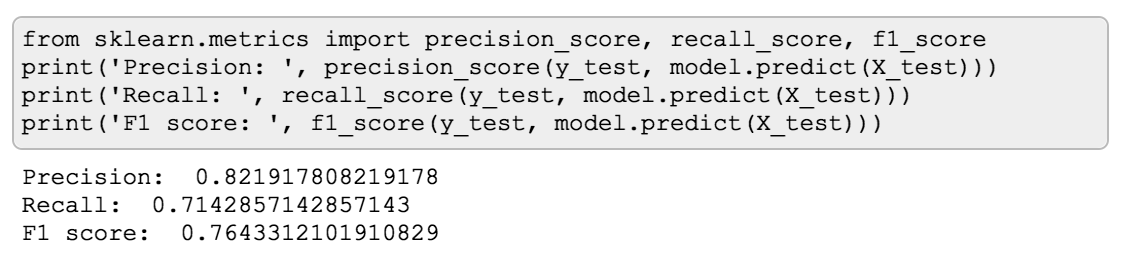
To get precision, recall and f1 score for a model, you can import these metrics from sklearn.metrics and call them in the same manner as confusion_matrix (actual values first, then predictions):
Tip: Evaluation metrics differ - some you want to maximize, others - to minimize. Scikit-learn has a helpful naming convention. If the name of a metric has the word “score” in it, it’s a metric you want to maximize. If it has words “loss” or “error”, that’s a metric to minimize.
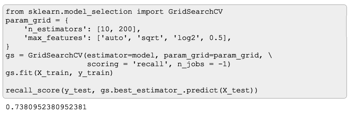
While it may be difficult to compare confusion matrices of different models, you can easily use Precision, Recall and F1 score to choose the best
one. For instance, if you want to use GridSearchCV to find hyperparameters that will give you a model with the highest
Recall, you can pass recall as a scoring parameter:
Matthews Correlation Coefficient
Accuracy and F1 Score are not the only ways to sum up a confusion matrix in a single number. There’s also, for example, Matthews Correlation Coefficient:
$$\text{MCC} = \frac {\text{TP}\text{TN} - \text{FP}\text{FN}}{\sqrt{(\text{TP}+\text{FP})(\text{TP}+\text{FN})(\text{TN}+\text{FP})(\text{TN}+\text{FN})}}$$
One important thing to notice about this formula is that MCC takes into account all 4 cells of Confusion Matrix, unlike F1 Score. Indeed, F1 score is based on Precision and Recall, neither of which adds True Negatives to the equation. This has some interesting implications. Let’s see how MCC is different from F1 Score with a couple of examples.
MCC vs F1 score
First, let’s take the following dataset and model:
- Data: 100 samples, where 95 of them are positive examples and only 5 are negative
- Model: DummyClassifier that always predicts a positive class
Let’s see what a confusion matrix looks like in this case:

Naturally, the accuracy of such classifier will be 95%. Interestingly F1 score is even better - 97.4%:
$$\text{F1 score} = \frac {2*\text{TP}} {2*\text{TP} + \text{FP} + \text{FN}} = \frac {2*95} {2*95 + 5} = \frac {190}{195} = 0.974$$
What about MCC?
$$\text{MCC} = \frac {\text{TP}\text{TN} - \text{FP}\text{FN}}{\sqrt{(\text{TP}+\text{FP})(\text{TP}+\text{FN})(\text{TN}+\text{FP})(\text{TN}+\text{FN})}} = \frac {950 - 50} {\sqrt{100955*0}} = \text{undefined}$$
In this example scikit-learn will return 0 with a big red warning that it’s actually undefined, and this is because division by 0 is happening here.
From this example, we can already see that from all the three metrics - accuracy, F1 score and MCC, Matthews Correlation Coefficient was the only one that gave me a red flag that something’s fishy is about this model, which is indeed the case since the model is a DummyClassifier.
Ok, let’s take a less extreme example. This time the data will remain the same, but the model will actually predict something.
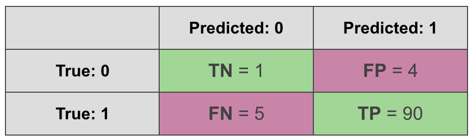
$$\text{F1 score} = \frac {2*\text{TP}} {2*\text{TP} + \text{FP} + \text{FN}} = \frac {2*90} {2*90 + 4 + 5} = \frac {180}{189} = 0.952$$
$$\text{MCC} = \frac {\text{TP}\text{TN} - \text{FP}\text{FN}}{\sqrt{(\text{TP}+\text{FP})(\text{TP}+\text{FN})(\text{TN}+\text{FP})(\text{TN}+\text{FN})}} = \frac {901 - 45} {\sqrt{94955*6}} = 0.135$$
Ok, but what if we switch what we call a positive class and a negative class, leaving everything else the same? In this case the confusion matrix will look a bit differently:
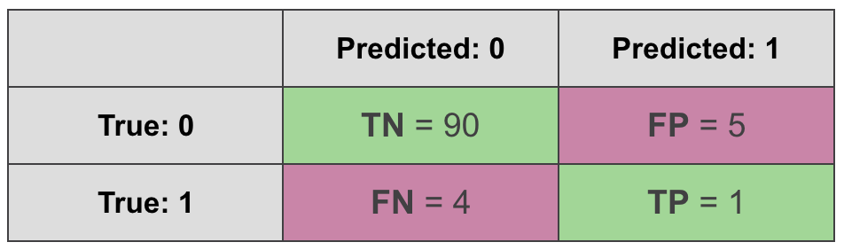
The data is the same, the model is the same, the only thing that has changed is what we call “positive” and what we call “negative”.
$$\text{F1 score} = \frac {2*\text{TP}} {2*\text{TP} + \text{FP} + \text{FN}} = \frac {2*1} {2*1 + 4 + 5} = \frac {2}{11} = 0.182$$
$$\text{MCC} = \frac {\text{TP}\text{TN} - \text{FP}\text{FN}}{\sqrt{(\text{TP}+\text{FP})(\text{TP}+\text{FN})(\text{TN}+\text{FP})(\text{TN}+\text{FN})}} = \frac {190 - 54} {\sqrt{6595*94}} = 0.135$$
We get the same MCC but F1 score is suddenly different. Why is that? This happens because F1 score takes into account true positives but not true negatives. This makes it sensitive to what we decide to call a “positive” class and what we refer to as “negative class”. MCC, on the other hand, is not sensitive to it.
So all things considered, I find that MCC is a better way to summarise a confusion matrix in a single number when you have a binary problem. Unfortunately, one downside of MCC is that it’s hard to extend it to multi-class problems.
Up until this point all the metrics I mentioned only took into account whether a model’s prediction was correct or not. But many classification models output a probability of a sample being positive or negative, and there are metrics and diagnostic tools that leverage that.
ROC Curve/AUC score
One popular way to measure performance of a classifier that outputs probabilities is a ROC curve. ROC stands for Receiver Operating Characteristic which probably doesn’t help much in explaining how it works or what it means.
ROC curve is a plot. On the Y-axis it has the True Positive Rate of a model: out of all samples that were positive, how many the model classified as positive?
On the X-axis it has the False Positive Rate: out of all the samples that were actually negative, how many the model confused for positive?
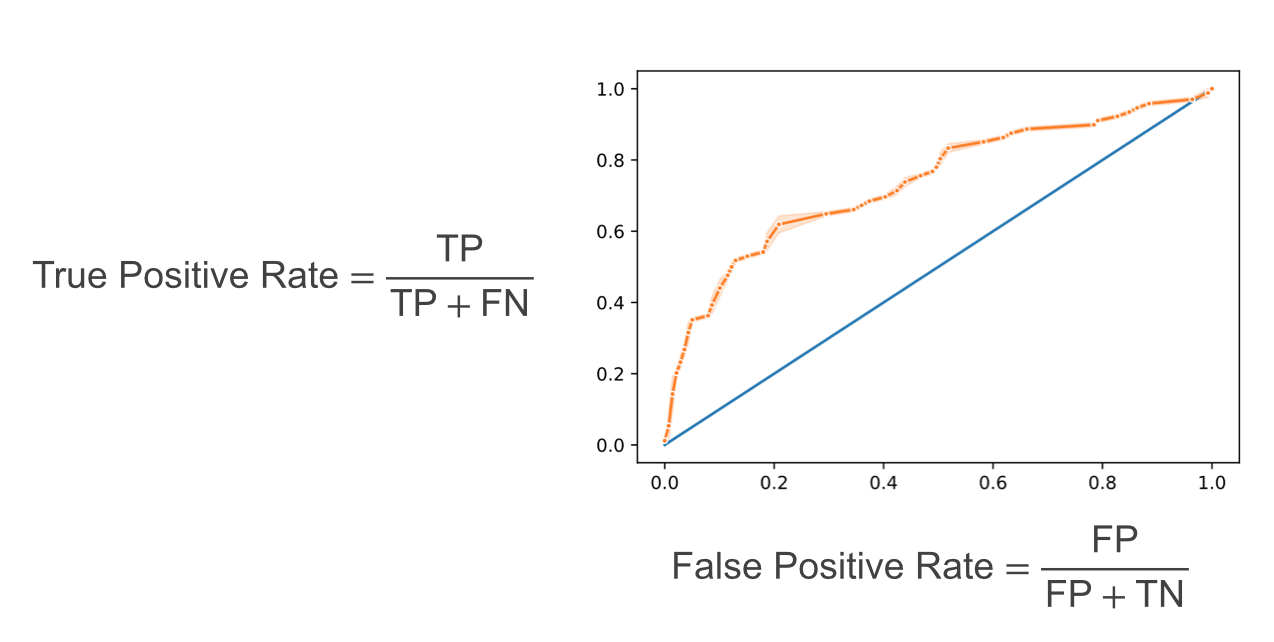
If you’re asking yourself, why is it a curve and not a dot? That’s a good question! This is where the probabilities as output of a model come to play. When we have a model that outputs a probability of example belonging to a class, there’s always a probability threshold, by default 50%, that serves as a decision boundary for the prediction. If the probability of belonging to class 1 is higher than 50%, then we’ll predict class 1. But we can change this threshold! We can decide to predict that a sample belongs to a positive class only if the probability of that is higher than, say, 80%. But if we do that, the number of TP, FP, TN and FN will change. Why? If we had a sample of positive class that was previously predicted to be positive with only 65% probability, it will now become a false negative.
So what ROC curve represents is all the combinations of True Positive Rate and False Positive Rate as we change the probability threshold. Each dot on the plot corresponds to these rates at a certain probability threshold.
The next reasonable question would be - ok, what would be a “good” curve? To understand this, I find helpful to think of what would ROC curve look like in a perfect case where there’s a threshold that allows the model to split the classes without making mistakes. In this unrealistic scenario, at that threshold, the True Positive Rate will be equal to 1 (as we won’t have any false negatives), while the false positive rate will be 0 (no false positives). As we move the threshold one way or the other, one of those rates will remain the same, but the other will change:
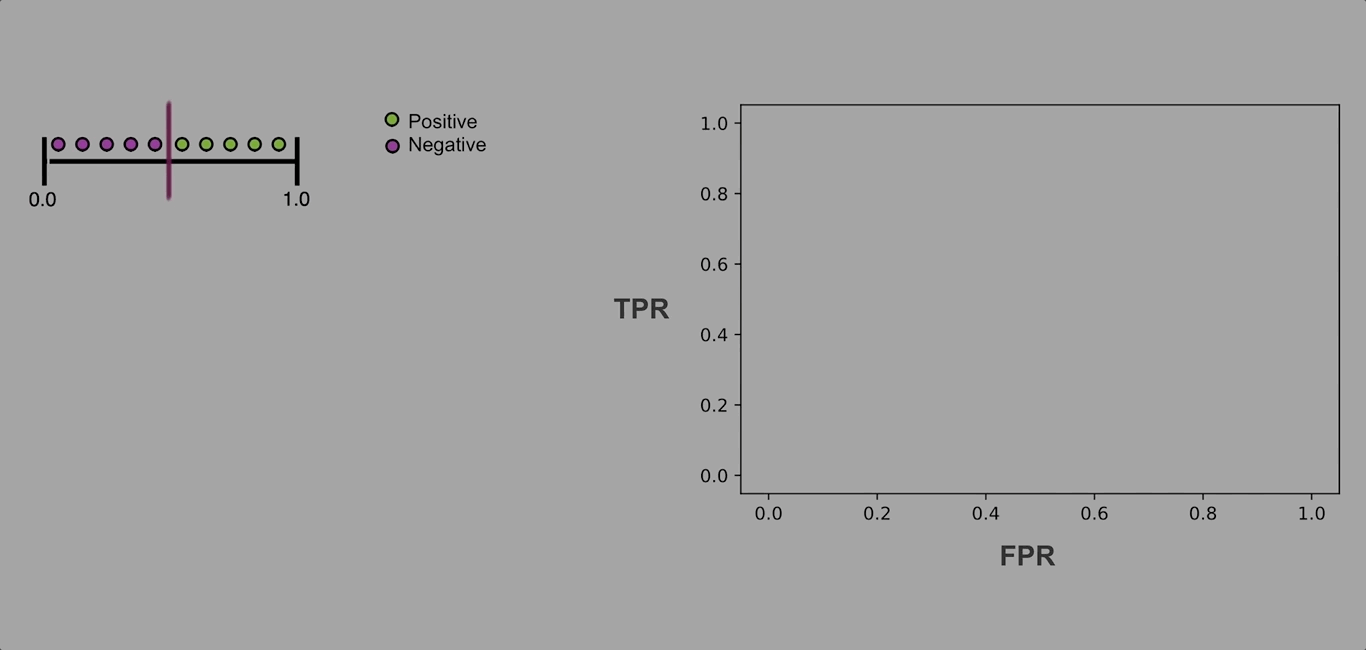
The resulting ROC curve will be “glued” to the upper left corner of the plot. So, in practice, we want the ROC curve to be as close to that corner of the plot as possible.
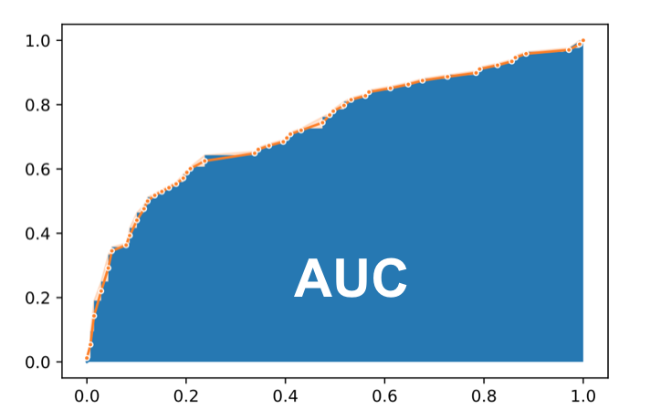
Now, we could compare different models by plotting their ROC curves, but it still would be more convenient in many cases to have a single number metric for comparison. The evaluation metric that helps in this case is AUC score.
AUC stands for Area Under Curve and it is simply the percentage of the plot box that lies under the ROC curve. The closer it is to 1 (100%), the better.
Precision/Recall Curve
Another curve that you may see being used is called Precision/Recall curve. The idea is exactly the same - we’ll move the the probability threshold and plot combinations of two metrics, in this case, however, we’ll have Precision on the Y-axis, and Recall on the X-axis. In exactly the same way we can calculate AUC for this curve.
So what’s the difference? I’ll illustrate with an example. Again, I’ll create a class-imbalanced dataset, and train a simple Logistic Regression on.
This time I’ll take the output probabilities, and plot both curves side by side.
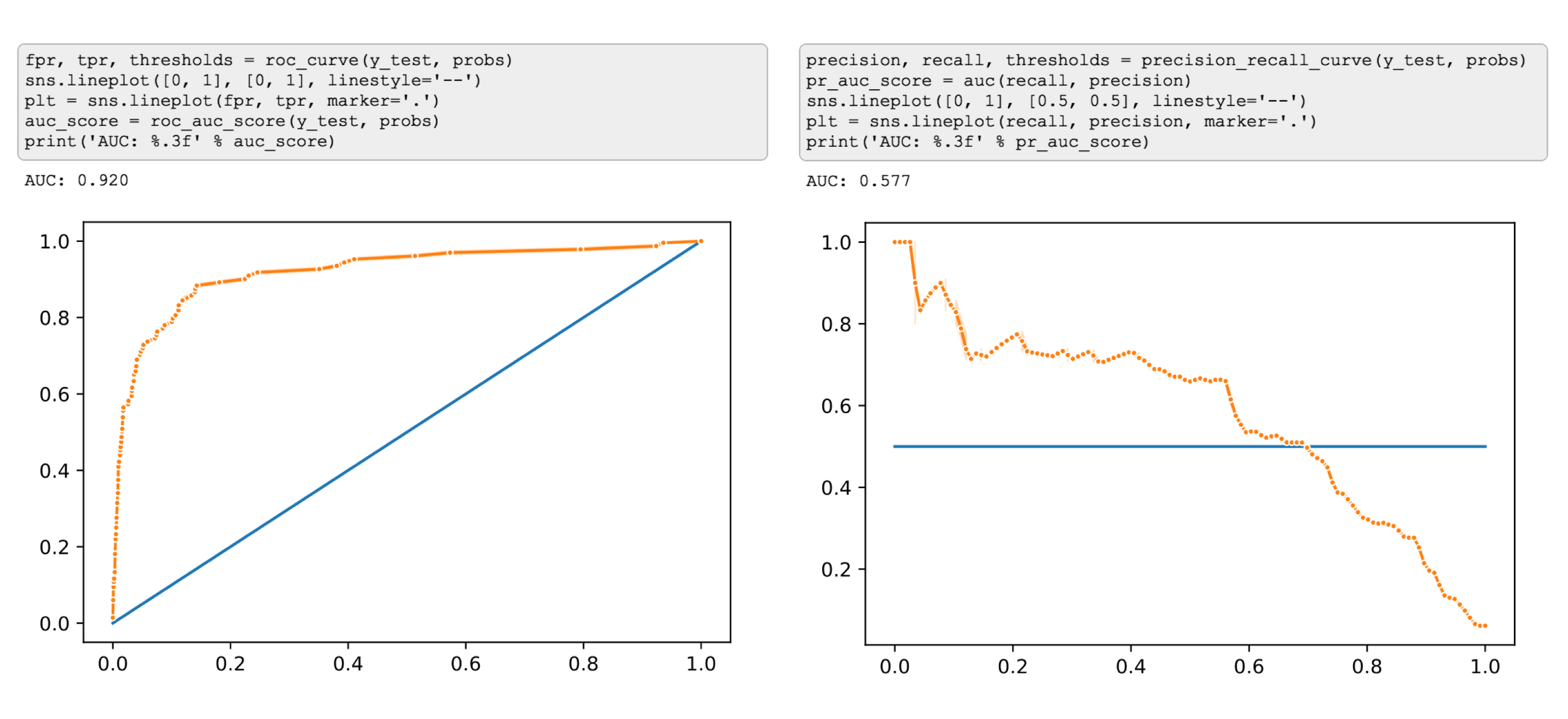
I think by now you already got the idea that in case of a class-imbalanced dataset we’ll see two very different pictures from these curves ;)
Log Loss
Logarithmic Loss aka Log Loss, is another evaluation metric that takes into account the output probabilities. It is commonly used as a loss function. (If you want to learn more about log loss as a loss function, check out this article )
Log Loss quantifies the performance of a classifier by penalising false classifications and taking into account the uncertainty of the predictions which gives you a more nuanced view into the performance of our model compared to accuracy.
In case of a binary problem log loss it is often presented as follows (the equation for multi-class looks a little different):
$$-\frac{1}{n} \sum_{i=1}^{n} (y_i\log p_i + (1 - y_i) \log (1 - p_i) )$$
Here:
- N is the number of observations
- $y_i$ in case of a binary problem ends up being the same as the true label (0 or 1) of the $i_th$ sample
- $p_i$ is the model’s predicted probability that sample i is 1.
Tip: The negative sign in the equation is a matter of convenience. It is easier to compare performance of models using a positive metrics, but the probabilities in the equation are always <1, and the log of numbers < 1 returns negative values. So without the negative sign we would have to deal with a negative metric, which can be confusing to work with.
This is what log loss looks like when a true label is 1.
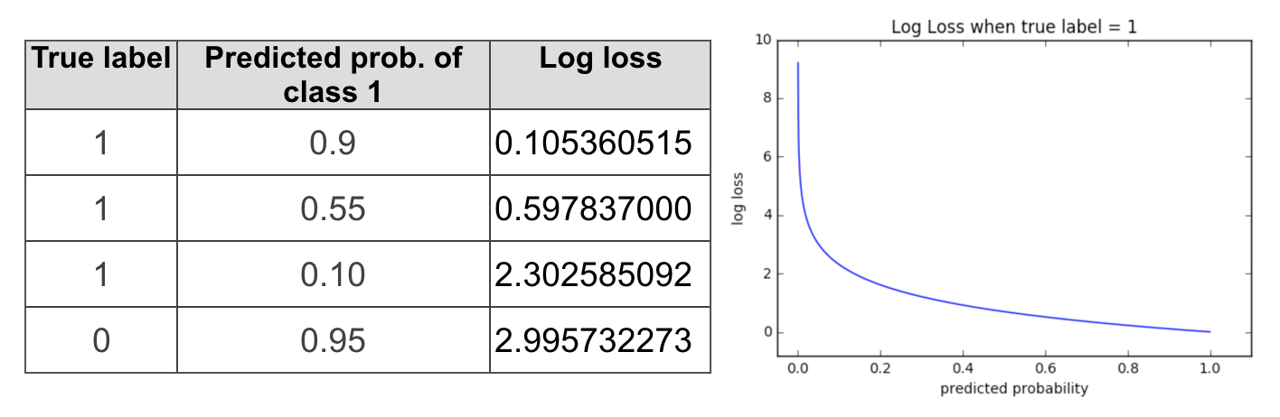
If the model is confident in predicting 1 (probability of 1 is close to 1), log loss will be quite low. As the predicted probability decreases, however, the log loss increases rapidly. If the predictions are confident and wrong, the penalties will be high.
Minimizing log loss will also get you better classification accuracy, but if you want to make sure that the predictions of your model are not only correct but also confident, then log loss is the metric to go with.
If you made it this far - thank you! These are, of course, not the only existing evaluation metrics for classification problems, there’s more! But I find that these are essential to understand.
Update Check out more posts about evaluation metrics:
- Part 2: multi-class classification
- Part 3: regression metrics